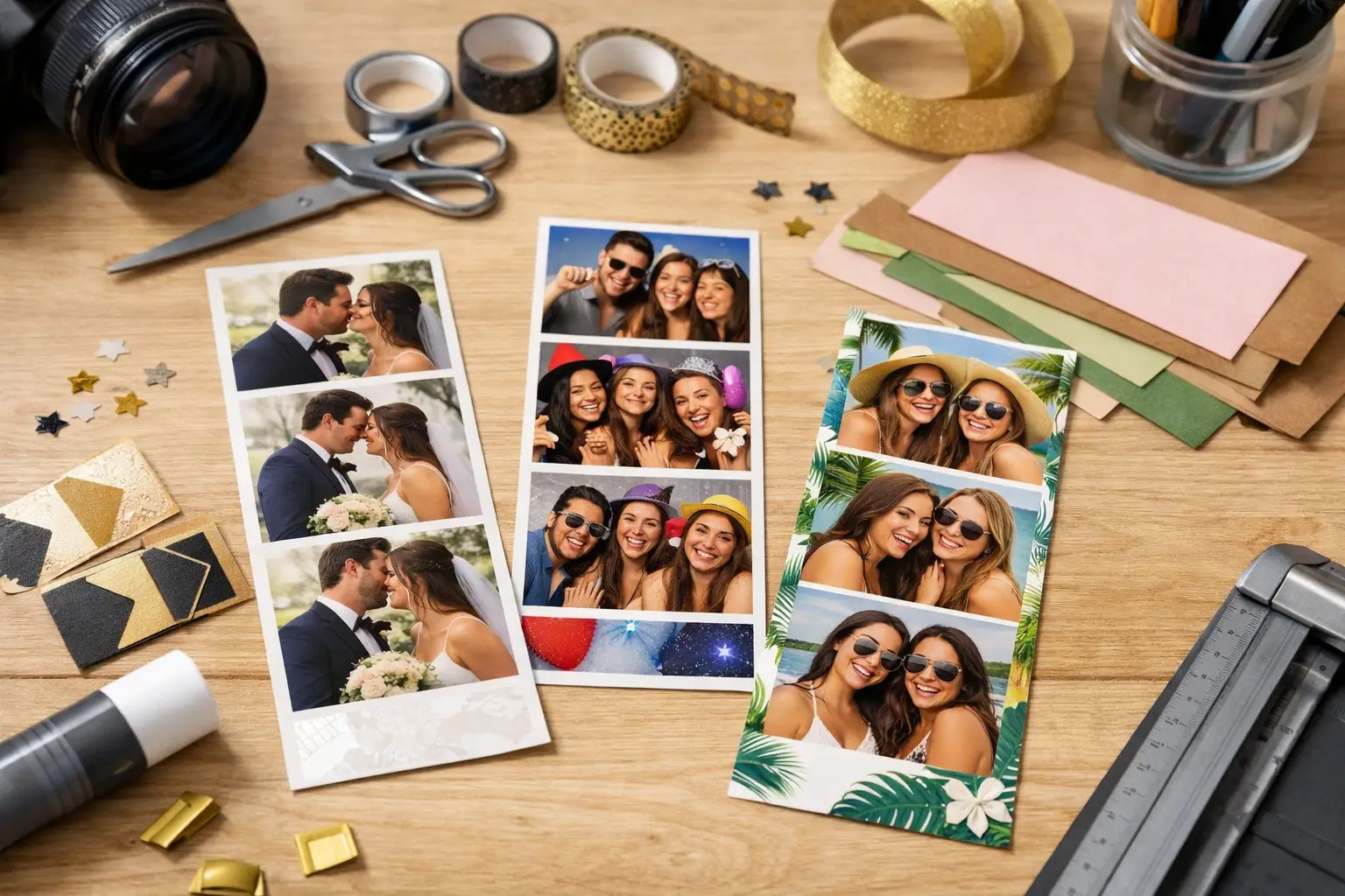
A great photo strip does more than print four funny faces. It becomes a mini event poster guests carry home, stick on the fridge, tuck into a scrapbook, or share before they have even left the venue. Knowing how to customize photo strips means turning that small print into a keepsake that looks intentional, fits the room, and brings people back to the moment every time they see it.
For a Los Angeles wedding, a Hollywood launch party, an Orange County birthday, or a polished corporate celebration, the best designs feel connected to the event without making guests feel like they are holding an ad. That balance is where a professional photo booth team and a smart design plan make all the difference.
Start With the Event’s Visual Story
Before choosing fonts or colors, decide what the strip needs to say about the event. A black-tie reception and a beachy birthday can use the same photo booth, but they should not leave guests with the same printed experience.
Look at the invitation, floral palette, table settings, signage, and venue. Pull two or three elements that can carry through to the photo strip. For a wedding, that may be a warm ivory background, a soft floral line drawing, and the couple’s monogram. For a corporate event, it may be the campaign color, a clean typeface, and a concise event hashtag. For a milestone party, it could be a playful custom illustration that captures the guest of honor’s personality.
The goal is not to cram every design detail onto two inches of paper. It is to create recognition. When the strip looks like it belongs at the event, the whole experience feels more elevated.
How to Customize Photo Strips Without Overdesigning
Photo strips are small, so hierarchy matters. Guests should be able to understand the design in a glance: who or what the event celebrates, when it happened, and perhaps where they can share it. Everything else is optional.
Start with one focal element. That could be the newlyweds’ names, a birthday phrase such as “Cheers to 40,” or a campaign logo. Then support it with a date, location, event hashtag, or short message. A line like “Best Night Ever” can add energy. A paragraph about the company’s history cannot.
White space is your friend. Dense borders, multiple fonts, tiny text, and too many logos can make even beautiful photos feel crowded. Keep the artwork away from the image areas, too. Faces, hands, and big group poses should stay center stage.
A useful rule: if a guest has to squint to read it at arm’s length, simplify it. The strongest strips are easy to recognize from across the room and still look polished up close.
Choose a Layout That Matches Guest Behavior
The classic vertical photo strip remains popular for a reason. It is familiar, flattering, and easy to save. A three-photo layout gives each image a little more room, while a four-photo layout creates a faster, more playful sequence of poses. If the event calls for more variety, a landscape postcard-style print can make room for larger group shots and bold design elements.
Think about the guest mix. An enclosed booth often inspires candid, close-up photos and works beautifully with a traditional strip layout. An open-air booth encourages bigger groups, full outfits, and more movement, so a wider layout can be a better fit. Green screen experiences add another decision: the virtual background should work with the strip template rather than compete with it.
There is no single right choice. A clean vertical strip may be perfect for an elegant wedding, while a large branded format may serve a product launch better. Choose the format based on how people will use the booth, not just what looks good on a screen.
Use Color, Fonts, and Borders With Purpose
Color sets the mood quickly. Soft neutrals and delicate metallic accents work well for formal celebrations. Saturated colors, neon details, and bold patterns can bring the right energy to birthdays, school events, and brand activations. Still, print quality changes how colors appear. Super-dark backgrounds can show fingerprints, and very pale text can disappear under venue lighting.
Use high contrast whenever text needs to be read. If the event palette is light blush and champagne, add a darker accent for names or dates. If the design is black or navy, make sure the lettering is bright enough to stand out. The photo booth flash and professional lighting will make the images pop, but the artwork must hold its own on paper.
Fonts deserve the same restraint. One display font paired with one easy-to-read supporting font is usually enough. Script lettering can be elegant for names, but it is best used sparingly. A hard-to-read script across the bottom of every strip can turn a thoughtful detail into a missed opportunity.
Borders can help frame the photos, especially for a classic or retro look. Keep them consistent with the event style. A thin gold line can suit a formal reception. A colorful illustrated frame can suit a kid-friendly celebration. Heavy borders only make sense when they are part of the concept, such as a filmstrip-inspired entertainment event.
Make Branding Feel Like Part of the Fun
For corporate gatherings and sponsored events, photo strips can travel far beyond the venue. Guests post them, text them, and keep them on desks. That makes the print a valuable branded touchpoint, but only if it still feels worth keeping.
Put the logo where it is visible but not dominant. The bottom panel or a small corner placement is often enough. Pair it with a concise campaign line, event name, or hashtag. If your activation uses a custom backdrop or green screen scene, repeat a small visual cue from that environment on the print for a more connected experience.
Avoid treating the strip like a flyer. Guests came to have fun, and the best branded design respects that. When the photos look amazing and the branding is tasteful, people are far more likely to share the finished image voluntarily.
Design for Real Photos, Not Just a Mockup
A photo strip template can look perfect on a laptop and still fail during an event. Real guests wear bright outfits, pose in large groups, hold props near their faces, and stand in front of varying backdrops. Test the template with actual sample images before approving it.
Ask whether the frame cuts too close to the photo area. Check that a dark outfit will not disappear into a dark border. Make sure the text remains readable beside a colorful green screen background. If a logo is placed over an image, confirm it does not land on someone’s face in the most common poses.
This is especially important for weddings and high-visibility brand events, where the booth experience is part of the overall production value. A good template should flatter the photos first and decorate them second.
Include the Details Guests Will Want Later
The date is usually worth including, particularly for weddings, anniversaries, reunions, and milestone birthdays. A location can also add meaning when guests have traveled for the celebration. For branded events, an event hashtag may be more useful than a full address or lengthy campaign statement.
Keep the wording short and personal. “Maya & Jordan, 06.14.26” has more staying power than a generic wedding slogan. “Studio Night at The Sunset Room” gives a corporate party a sense of place. For birthday events, a custom phrase that sounds like the guest of honor is often better than a stock line.
If there are two print copies, consider a subtle variation only if it serves a purpose. For example, a wedding may have the same design on both prints so one goes to the guest and one goes into a guestbook. Most events benefit from keeping every copy identical and easy to recognize.
Review the Whole Booth Experience
The print is only one piece of the final result. Backdrop choice, booth style, lighting, props, and on-site flow all influence whether guests love what they receive. A luxe template paired with a wrinkled-looking backdrop or dim lighting will not deliver the same impact.
That is why customization works best when it is planned alongside the booth setup. Flash Life Photo Booth helps hosts match custom templates to the right booth format, backdrop direction, and guest experience, whether the priority is classic wedding keepsakes, energetic group shots, or clean brand visibility.
Before event day, approve a final proof that shows the exact wording, colors, logo placement, and photo layout. Confirm spelling carefully, especially names, dates, hashtags, and sponsor marks. Then make sure the team running the booth understands the intended mood: polished and elegant, colorful and high-energy, or somewhere in between.
A customized photo strip should make guests smile before they even look at the photos. Keep the design clear, let the personalities in the frame do the talking, and create a print that feels too good to throw away.
Leave a Reply