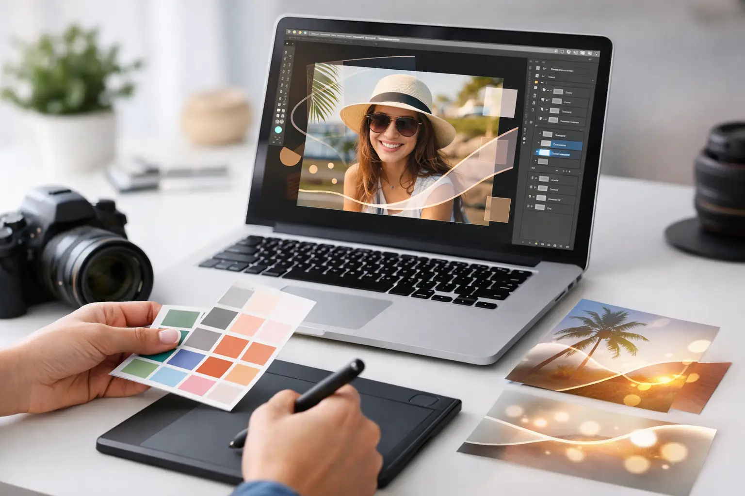
A great photo booth picture should still look like a great photo a week, a month, or five years after the event. That is the real test of how to design branded photo overlays: the branding needs to frame the moment, not compete with it. Whether you are planning a wedding in Orange County, a Hollywood launch party, or a corporate celebration in Los Angeles, the right overlay turns every guest photo into a polished keepsake people want to save and share.
Start With the Event Experience
Before choosing a font, logo placement, or color palette, decide what the photo should make guests feel. A wedding overlay might be romantic and refined. A milestone birthday can be bold, playful, and full of personality. A brand activation often needs to feel clean, intentional, and instantly recognizable from a social post.
This is where many designs go off track. It is easy to treat an overlay as a place to fit every event detail, but guests are not taking a flyer home. They are taking a photo of themselves having fun. The design should support that memory with a clear visual direction.
Start with three simple questions: What is the event’s visual style? What information truly needs to appear? Where will guests most likely share these images? A formal black-tie fundraiser and a colorful school dance can use the same high-quality photo booth setup, but their overlays should not look remotely alike.
Build a Clear Design Hierarchy
The best overlays guide the eye in seconds. The guest faces should always be the star. After that, the event name, couple’s names, campaign message, or logo should be easy to spot without taking over the image.
Think of the layout in layers. The photo area comes first, followed by the essential identifier, then decorative details. If every element is large, bright, and competing for attention, nothing feels premium. A simple design with intentional spacing usually photographs better than a crowded one.
For most events, limit the primary message to one focal point. For example, a wedding could feature the names and date. A corporate event could feature a logo plus a short campaign phrase. If the client needs sponsors, hashtags, social handles, and multiple logos, place the secondary information in a quieter area of the frame or on a companion sharing screen rather than squeezing it all around the photo.
Give Faces Enough Room
This sounds obvious, but it is the most common photo overlay mistake. Test the design using actual images of one person, two people, and a larger group. A bottom banner that looks elegant in a blank mockup may cut across hands, outfits, or faces when guests lean into the frame.
Open-air booths are especially flexible for group photos, so leave enough visual breathing room around the edges. For enclosed booth strips, a slimmer frame may be more appropriate because the photo format is naturally tighter. The booth style and overlay should be designed together, not as separate decisions.
Choose Colors That Work on Real Photos
Your event colors may look fantastic on an invitation, but photo overlays have a tougher job. They need to look good against dark suits, bright dresses, patterned backdrops, flash photography, and every skin tone in the room.
Use brand colors or event colors as accents rather than covering every border in saturated color. White, black, cream, metallic-inspired neutrals, and transparent details often give the photo more room to breathe. If a bright color is central to the event identity, balance it with a neutral background or use it for a small graphic element and type accent.
Contrast matters just as much. Pale text on a pale photo can disappear, while black type on a dark image can feel muddy. A subtle translucent panel, solid color block, or carefully placed border can protect readability without making the photo look boxed in.
Print and digital sharing can also behave differently. Fine pastel details may look lovely on a phone but lose impact on a printed strip. Deep colors may look richer in print but heavier on screen. A professional photo booth team should test the final file for the delivery format guests will receive.
Use Typography With a Purpose
Fonts create instant mood. Script lettering can feel elegant for weddings and bridal showers, while clean sans serif type feels modern for brand events and corporate parties. The catch is readability. A highly decorative font may look beautiful for names, but it is rarely the right choice for dates, hashtags, URLs, or small sponsor information.
Use no more than two font families in most overlay designs. One can carry personality, while the other keeps supporting details clear. Make sure the type feels intentional with the event materials already in play, including invitations, signage, step-and-repeat backdrops, and presentation screens.
For branded events, follow the approved brand guidelines whenever possible. Logo spacing, official colors, and font rules exist for a reason. But brand consistency does not mean placing a huge logo across the bottom of every photo. A smaller, well-positioned mark often feels more elevated and earns more organic shares because guests still see themselves first.
Design for the Format Guests Will Receive
A branded overlay is not one-size-fits-all. A classic photo strip, a 4-by-6 print, a GIF, a boomerang, and a social-ready digital image each require different spacing and visual treatment.
For a multi-photo strip, keep the design consistent across each image and make the bottom panel easy to read. For a 4-by-6 layout, you have more space for a hero image, event detail, and graphic frame. For digital sharing, avoid tiny copy that becomes unreadable on a phone screen. The design should still look sharp when viewed quickly in a text message or Instagram story.
If your event includes green screen photography, coordinate the overlay with the virtual backdrop. A tropical branded backdrop paired with a formal navy-and-gold frame can feel disconnected. The background, lighting, and overlay should tell one story. That is how a novelty photo turns into a branded experience.
Add Personality Without Adding Clutter
The strongest photo overlays include a detail guests remember: a custom illustration of the venue, a monogram, a fun icon, a subtle pattern, or a line that reflects the event theme. These details make the design feel custom without turning it into a scrapbook page.
For a birthday party, that might mean a disco ball icon or a retro color treatment. For a wedding, it could be a floral accent pulled from the invitation suite. For a product launch, a graphic element from the campaign creative can tie the booth directly to the larger activation.
Be careful with trends. Chrome text, heavy gradients, neon outlines, and maximalist graphics can be perfect for the right party, but they date quickly. If the goal is a timeless keepsake, use trend-led elements in smaller doses and keep the overall layout clean.
Review the Overlay in Real Conditions
Never approve an overlay based only on a screen mockup. Test it with representative photos, ideally in lighting similar to the event environment. Look at it on a phone, in print, and at full size. Check for text that becomes too small, logos that are too close to the edge, and border details that disappear against the background.
Also test with people standing in different positions. Guests do not pose like stock models. They lean in, throw up a peace sign, hold drinks, wear hats, and bring the whole group into the shot. Your design needs to work when the party gets lively.
At Flash Life Photo Booth, custom templates are planned around the booth format, event look, and final guest experience, because a beautiful design only matters if it performs smoothly during the celebration. This attention to the details helps the booth feel like a natural part of the event rather than an add-on in the corner.
A Simple Approval Checklist
Before sending the design to production, make sure it answers the practical questions that matter on event day:
- Are faces and outfits clear in every likely pose?
- Is the event name, logo, or key message visible at a quick glance?
- Does the color and type treatment match the event’s overall style?
- Has the file been tested for both print and digital sharing?
- Does the layout fit the selected booth and photo format?
A branded photo overlay is a small part of the event plan, but it appears in every guest memory that leaves the booth. Give it the same care as the invitation, décor, and welcome sign, then let the photos do what they do best: keep the energy of the celebration going long after the last flash.
Leave a Reply